Comparing PLG Homepage variations

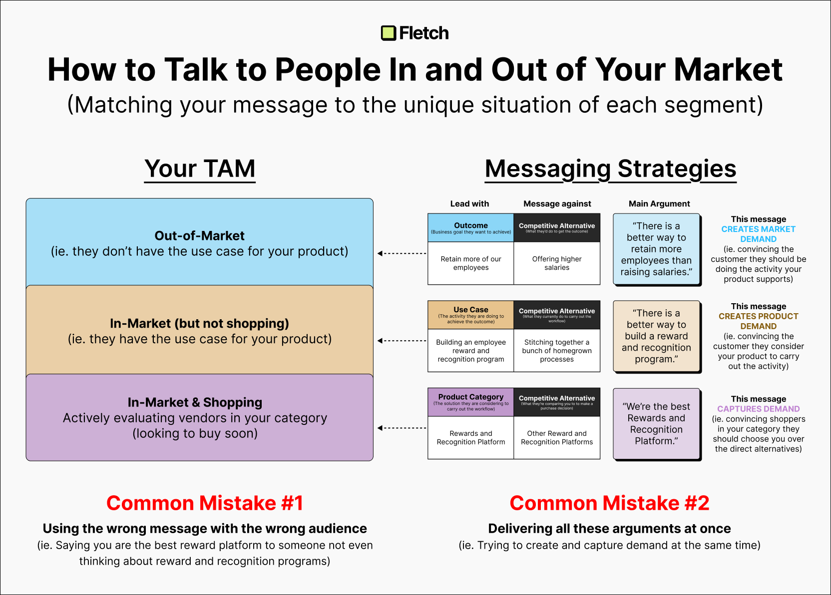
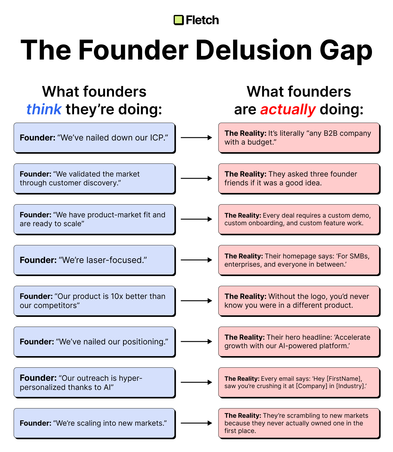
PLG homepage heroes should not be a TAM message.
Yet, most startups fall into this trap.
Just take a look at a few companies in the digital whiteboard category (Figma’s FigJam, Mural, Miro)
All of their homepage hero messages read like the intro slide to an investor deck.
- Big TAM (broad target customer)
- Ambitious vision (broad benefits & capabilities)
The problem with this type of hero message?
- It doesn’t help the prospect take action.
Your potential user doesn’t care about your ambitious vision to capture a broad market…
- They care about their situation — And the best messages tap into these situations.
Your hero should answer 3 main things:
1. What is it? (Product category)
This should be something crystal clear and RELATABLE for a potential user.
- Use a category that your customer will understand.
- Not the new category you want to own in the future.
2. Who is this for? (Target customer)
This should be your target ICP — You want your prospect to see themselves in your description.
- Be specific. Even if you are going after multiple segments, use your best fit customer segment.
- Don’t try and capture everyone in one description (TAM description)
3. What does it let me do? (Main capability)
This should be the most compelling aspect of your product (and usually represents the first “aha moment” for a new user).
- Be very specific in telling a prospect what they can do.
- Don’t try to explain the entire product or platform.
The big takeaway here?
It might feel good to have your website explain your vision and everything you do…
But this approach just strokes YOUR ego — and likely pushes prospects away.
Your website is for your customers—not for you.

Ben Wilentz
Founder, Stealth Startup


