The 4 Most Common Homepage Mistakes


Here's 4 PMM mistakes and how to avoid them.
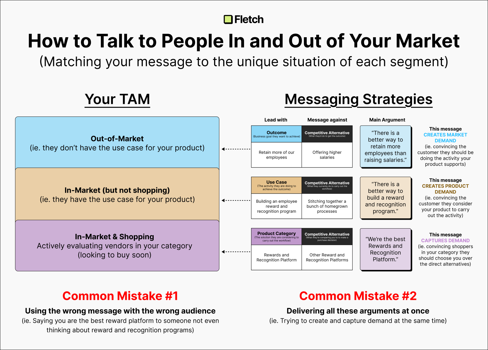
1. Too Many Messages
So many founders try to stuff in every possible aspect of the product into the homepage... without realizing that people hate information overload.
Instead...
- Drastically simplify and focus on the top three value propositions
- Move extra messages to other sub-pages
2. Divergent Product Categories
I totally understand not knowing what to call yourself... and I'm all for testing different concepts... But if you put them on all the same page, you have no idea what works and what doesn't! And having multiple categories confuses visitors!
Instead...
- Pick one category for your homepage
- Experiment in channels where you can immediate feedback (sales calls ideally)
3. The Impenetrable Wall of Benefits
When you just focus on outcomes without talking about what your product is, you become extremely ambiguous, unbelievable, and uncompelling.
Instead...
- Lead with the capabilities of your product and what the customer will be able to do with it
- Only after you've answered what and how can you talk about benefits
4. Vague Capabilities
Too often do founders speak way too high level about what their product lets customers do — which leaves customers confused and unconvinced.
Instead...
- Talk about capabilities that customers can actually imagine doing

Ben Wilentz
Founder, Stealth Startup


