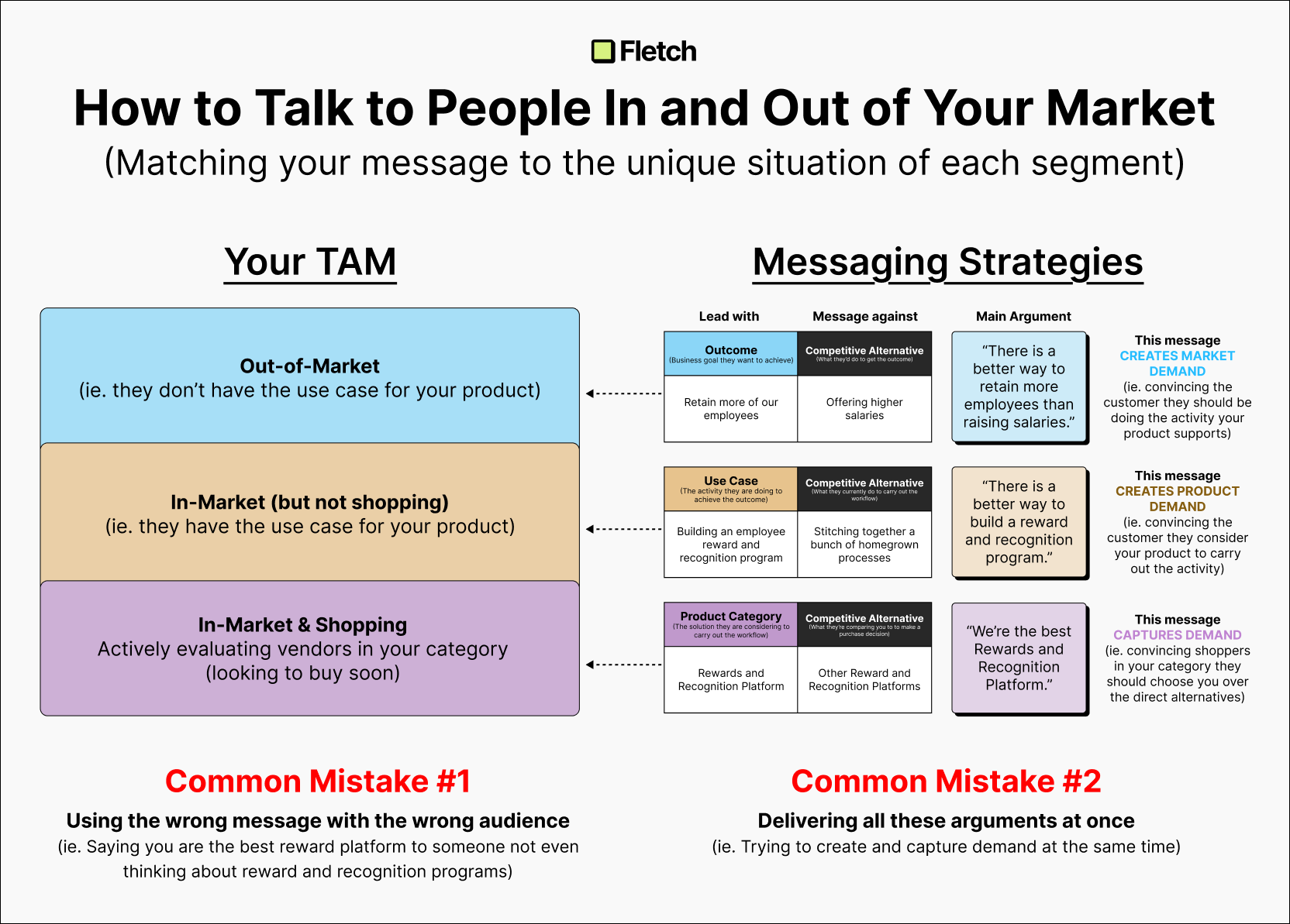
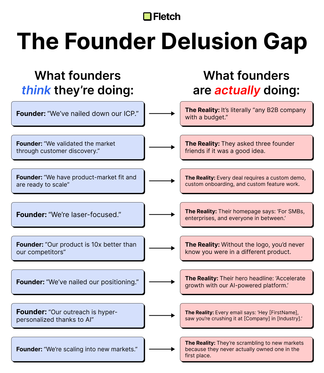
Three Reasons Your Posts Should Be Visually Consistent


Here are three reasons why your posts on LinkedIn should be visually consistent 👇🏻
1) Increased brand recognition
I cannot count how often people have said, "I knew it was a Fletch post before I even saw who posted it."
When all your posts have the same aesthetic, it helps reinforce the mental association.
2) Increased speed of creation
The blank canvas is the enemy of all artistic endeavors.
Having a design system eliminates a large chunk of the cognitive load and helps you get ideas out faster.
3) Ease of onboarding
Right now, Rob and I create all of our own posts.
But if we ever bring on a content marketer, having this fleshed out will make their onboarding process significantly smoother.
- --------
Let me be clear...
and I are NOT designers by trade.
Our loose "design system" was iteratively created over hundreds and hundreds of LinkedIn posts, client workshops, sales decks, etc.
And if you scroll far enough back, the posts look sooooooooo much worse than they do now.
But you're never too bad at design to not have consistency.
It's better to have a consistently bad design than to have a hodgepodge of good designs that don't match each other.
We use Figma for all our posts, but Canva is a great tool for most folks!

Ben Wilentz
Founder, Stealth Startup


